
Mobile-First vs Responsive Design: What’s the Best Choice for Web Development?
Going to a website that just… feels off on your phone? The buttons are too small, text is hard to read, or the pictures won’t fit your screen? That’s usually something pertaining to design, and it actually all comes down to the way the site has been built. The two common approaches are mobile-first design and responsive design, and the difference can influence the speed, usability, and search rankings of your site.
At Risians Technology, the best web design company in Dubai, we help clients sift through which method works best for their audience, content, and goals. Let’s unpack just what these methodologies mean and how to pick the one that best fits your business.
Mobile-First Design
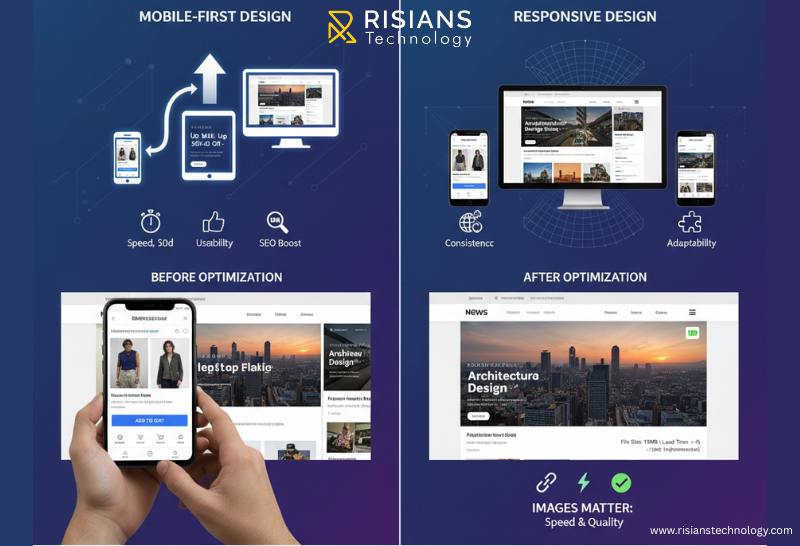
Mobile-first design simply implies designing from the smallest screen space down, usually starting with a smartphone, then scaling up to cover tablets, laptops, and finally desktop. The idea is potent: if it works well on mobile, it will well on anything else.
Unlike the responsive design methods which start with a desktop layout and remove stuff for mobile, the mobile-first approach simply focuses on what’s really necessary—speed, usability, and keeping the site clean and simple. Developers have also referred to this as progressive enhancement, defining, essentially, starting small and building up.
As trusted web-development company Dubai, we help clients think through what is truly important for mobile users, and this usually includes fast-loading pages, buttons that can easily be tapped, and content that can readily be skimmed.
Key Principles
• Focus on core content and important interactions first
• Use lightweight code and assets for faster load times
• Make navigation easy and tap-friendly
• Build for speed, so even slow connections feel smooth
Why It Works
· Mobile-first indexing from Google helps in SEO
· User experience is cleaner, less cluttered
· Faster mobile load times can increase conversion
· Prepares your site for an increasingly mobile audience
· Things to Watch Out For
· Scaling up to bigger screens can feel limiting
· Design freedom is a bit limited due to minimization
· Needs proper planning from the very beginning
What Is Responsive Design?
Responsive design circles in on a different tack. Rather than beginning from smaller touchscreen mobile devices, it prepares a flexible design that automatically scales to adapted its features for any screen size. The layout, the appearance of images, and the styling, all adjust based on whether a person is on a smartphone, a tablet, or a desktop.
Any web design company Dubai will keep your site balanced and organized, guaranteeing a consistent experience across every device.
Core Features:
· Fluid grids that resize proportionately
· CSS media queries for device-specific adjustments
· Flexible images that fit containers
· Consistent design across all devices
Why It Works
· One site works for all devices, no separate mobile version
· Less maintenance effort
· Great for content-heavy sites such as blogs or portals
· Keeps branding consistent
Things to Watch Out For
· Mobile devices may load desktop-heavy features unnecessarily
· Can slow down smaller devices if not optimized
· Needs thorough testing across many screens
· Differences Between Mobile-First Approach and Responsive One
Mobile-first goes small to big. Responsive converts one design to all screens. Both want to achieve good usability; the difference, though, is in the mindset.
Images Matter
Images take up a significant amount of your page size. Excesses of poorly optimized images degrade both systems. Recommendations include:
· Use modern formats such as WebP or AVIF
· Use responsive image techniques with srcset
· Lazy load off-screen assets
· Compress images for maximum quality
· For the touch interaction on the mobile side
When to Go Mobile-First
Mobile-first comes before smartphone very much in the instance that most of the visitors are using smartphones, like with food delivery, retail, or transport-related establishments. If conversions, speed, and minimal friction count the most, then mobile-first will push those needs right into the front.
A website developer in Dubai could further guarantee this flow with mobile-first working effortlessly across other devices and attaining maximum individual performance.
When to Go Responsive
Responsive design fits well if, on the other hand, your audience split between devices like corporate sites, educational portals, or news platforms; if consistent branding and scalability are the priority, then usually responsive is the safer bet.
Quick Decision Checklist
· What percent of traffic comes from mobile vs desktop?
· Are mobile speed and conversions more important than desktop visuals?
· How complex is the content and design?
· What’s your budget and timeline?
· How important is long-term scalability?
· Can you test across multiple devices?
· Are you building from scratch or adapting an existing site?
Answering these questions makes it much easier to decide between the two approaches.
FAQ's
Which approach is appreciated by Google?
Mobile-first indexing is preferred by Google, but a well-optimized responsive design will also do its work.
Is responsive design enough for SEO?
Yes, if it is fast and mobile-friendly, and accessible.
Should e-commerce businesses choose mobile-first?
Yes, because the larger share of shoppers browses and purchases sites through phones.
Can you combine both strategies?
Definitely. A lot of developers use a mobile-first responsive route to get the best of both spheres.
Do images and media affect the choice?
Heavy visuals can slow mobile-first sites if not optimized, while responsive sites may push way too many assets to small screens.
Wrapping Up
Both mobile-first and responsive design have their place. Mobile-first is ideal for speed and mobile-heavy audiences; responsive designs help hold together consistent experiences across every device whatsoever.
If you want a website that works fabulously everywhere, a skilled Dubai website developer will make sure that happens. In Risians Technology, we help businesses build websites that feel smooth, look beautiful, and work like a charm-whether you need a slim, mobile-first, e-commerce site, or an eloquent, flexible response platform.
Ready to make your website work for everyone, everywhere? Get in touch with us today and let’s build a site your visitors will actually enjoy using.
Have you noticed websites that just feel effortless on your phone? What made them easy to use? We’d love to hear your thoughts..


